Create Hollywood Title Effect with Photoshop
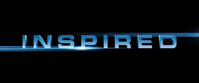
Final Product What You'll Be Creating

Nowhere can you find cooler text effects than in the movies! Well...almost nowhere. And there’s no reason why you can’t incorporate a little Hollywood flair into your designs. Here, we’re going to create a text effect. By getting creative with layer styles and using a brush effect, you’ll see these types of effects are easier to create than they seem!
Step 1
Start by going under the File menu, choosing New, and creating a new document that’s about 11 inches wide by 4.5 inches tall at 100 ppi.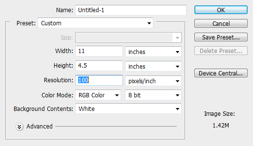
Step 2
With your Foreground color set to black, press Option-Delete (PC: Alt-Backspace) to fill the Background layer with black, then select the Horizontal Type tool (T) from the Toolbox, and click on the canvas to create a text layer. Here, I have typed the word “INSPIRED” in a font called Eurostile, because it has a sort of cinematic feel to it. Regardless of what font you choose for this effect, I do recommend you use a sans-serif font, as bolder typefaces work best. Once done, select the text, then click on your Foreground color swatch, and choose a light gray color.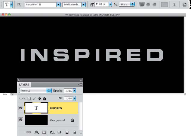
Step 3
At the bottom of the Layers panel, click on the Add a Layer Style icon, and choose Gradient Overlay. In the Layer Style dialogue, click on the down-facing arrow next to the gradient thumbnail and choose the Black, White gradient (the third one from the left in the top row), then change the Blend Mode to Overlay, set the Opacity to 90%, and increase the Scale amount just a bit. Also, turn on the Reverse checkbox to flip the colors.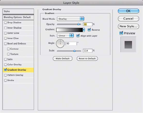
Step 4
Now, load the shape of this text as an active selection by pressing-and-holding the Command (PC: Ctrl) key and clicking on the text layer’s thumbnail (as shown here).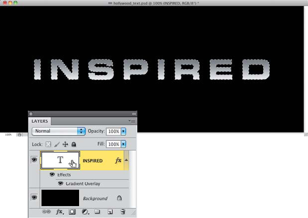
Step 5
Click on the Create a New Layer icon at the bottom of the Layers panel to create a new blank layer and fill the active selection with your Foreground color (the same gray color used to fill the original text layer) by pressing Option-Delete again. With the selection still active, from the Select menu, choose Transform Selection. This will put the selection into Transform mode. In the Options Bar, click on the Maintain Aspect Ratio icon (the chain link) between the width and height settings to lock the aspect ratio. Change the H (height) setting to 102% and the width will automatically change roportionately. Once done, press Return (PC: Enter) to commit the change and then press Delete (PC: Back space) to remove the area inside the selection. What’s left outside the selection now gives us the illusion the text is 3D.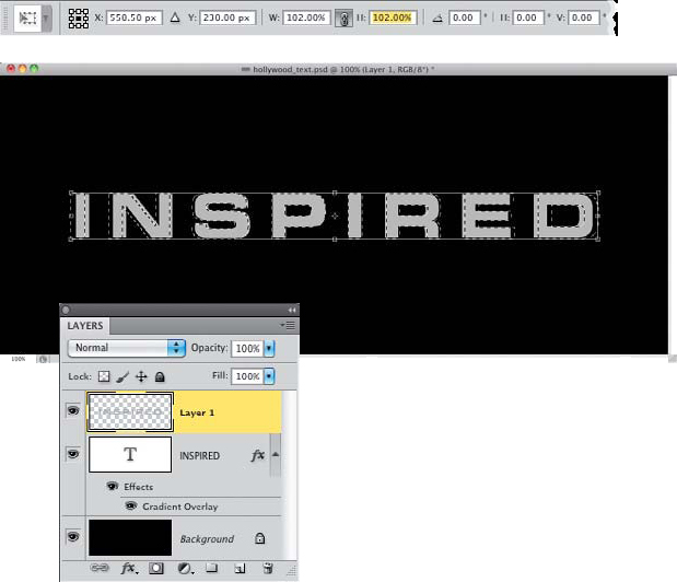
Step 6
To help give this a bit more dimension, just add a Gradient Overlay layer style to this layer the same way we did to the original text layer. This time, though, leave the Blend Mode set to Normal, reduce the Opacity to 75%, leave the Scale amount set to 100%, and do not reverse the gradient (so it will be opposite the other gradient). Click OK and then press Command-D (PC: Ctrl-D) to Deselect.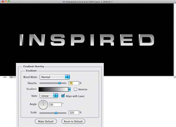
Step 7
Now, the only problem I see here is in the letter “N.” Notice how the inner corners don’t look right? Zoom in on the letter, then grab the Rectangular Marquee tool (M) from the Toolbox, and draw small selections over the areas where the gradient is missing (as shown here). Press-and-hold the Shift key to create multiple selections and press-and-hold the Option (PC: Alt) key to remove areas from the selections. Then, just fill these areas with the same gray we used before, and deselect. The layer style will automatically redraw over the new area, completing the shape.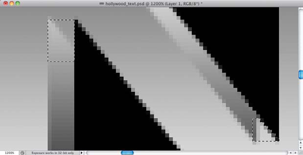
Step 8
Now to give the text some color. Sure we could have given the text a color when we started, but I like using an adjustment layer over gray-tone elements, because it makes it much easier to change the color when needed. So, go to the bottom of the Layers panel again, click on the Create New Adjustment Layer icon, and choose Hue/Saturation. In the Adjustments panel, turn on the Colorize checkbox, then set the Hue to 215, the Saturation to around 40, and the Lightness to –18. This will give you a nice blue cast over the text. Of course, feel free to play around with other color variations to get a different look.
Step 9
To add a final touch, we’re going to add some cinematic flares to enhance the effect. Add a new blank layer, get the Brush tool (B), and then choose the flare brush from the Brush Picker. Go to the Brush panel and, in the Brush Tip Shape options, set the Roundness of the brush to 50%. This will squash the brush down, making the flare a bit thinner. Also, increase the Size of the brush to 2000 px.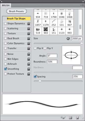
Step 10
Press D, then X to set white as your Foreground color, then zoom out of the document and click-and-drag out the bottom-right corner of the image window, so you can see the pasteboard area outside the canvas. Position your cursor to the side of the text, just outside the edge of the document, and click once to paint one instance of the flare. You can see here this adds the outer parts of the flare to the visible canvas area, giving the effect that the light is just out of view.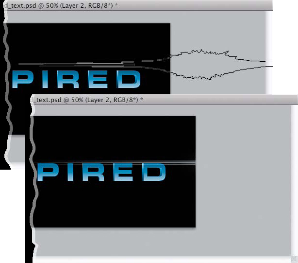
Step 11
Color swatch and choose a light blue color, or sample a blue color from the text. Set the Blend Mode to Hard Light and increase the Opacity to 100%. Set the glow Size to around 2 px and click OK when you’re done. As an option, you can put the flare into Free Transform mode and scale it vertically to basically “stretch” the pixels to cover more area. As a result, this will add a blur effect to the flare as you scale.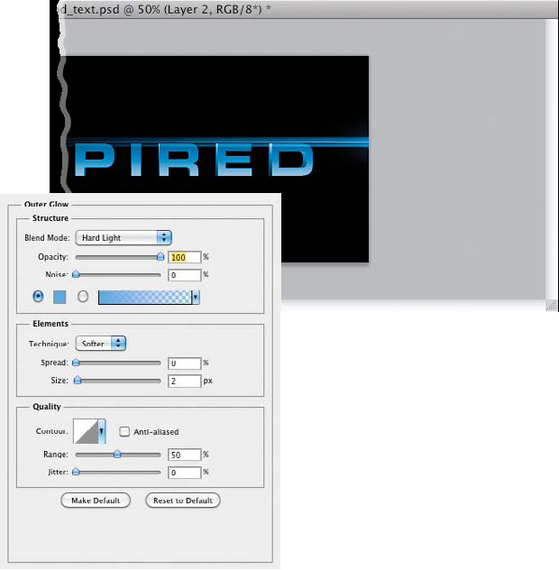
Step 12
Now use this same technique to add a flare from the other side of the canvas (or just copy the first flare layer, go into Free Transform, Right-click on it, and choose Flip Horizontal, then drag it to the left and beneath the text). Be sure to vary the position and scale of the flare to make it more interesting. Then, add the same Outer Glow layer style (by Option-clicking [PC: Alt-clicking] on the layer style in the Layers panel and dragging it onto the second flare layer).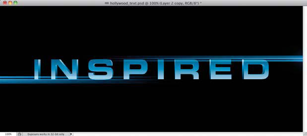
Step 13
You can size the brush down using the Left Bracket key ([) and add a small flare at the bottom of the letters. Make sure you add the same Outer Glow layer style to this one, too, to complete the effect. You can see how the text has the illusion of being in 3D with very dramatic lighting effects utilizing the flare brush in another interesting way.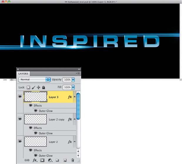
Final Image


Soph Laugh
December 26, 2011 at 10:36 PM
This is great, thank you. I'll try it out and if I'm successful in following your well-laid out instructions, I should have a nice new intro title for my blog!